
A brand system across menu, print, and storefront, designed, printed, and in daily use in an active café.
Rari-Tea ran on a logo and a menu, with no system underneath. The illustration-heavy menu was slow to scan, and a second location was coming with nothing built to carry across it. I was hired for the menu. A new menu alone wouldn't hold across two locations, so I proposed expanding the work into a full brand system across print, promotion, and physical space.
The tension to solve: stay playful and approachable while staying fast to use in a busy retail setting.
Four decisions shaped the system, from the menu out to the walls.
Product illustrations had buried the menu's hierarchy. I rebuilt it around type that ranks category, product, price, and customization, so customers scan by structure, not decoration.
subordinated decorative elements to the content across the campaign print, so the flyers and coupons stayed on-brand while the offer and details read first.
Viewing distance, scan speed, and print constraints drove the sizing, spacing, and contrast across every printed piece.
I set fixed rules for type, logo placement, palette, and composition so the café can produce new promos on-brand without a designer.
The system runs across four areas, from the counter to the storefront.
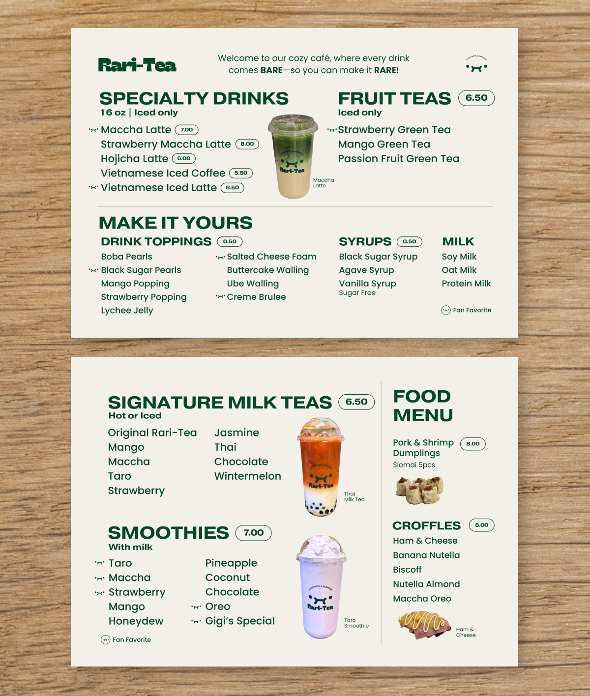
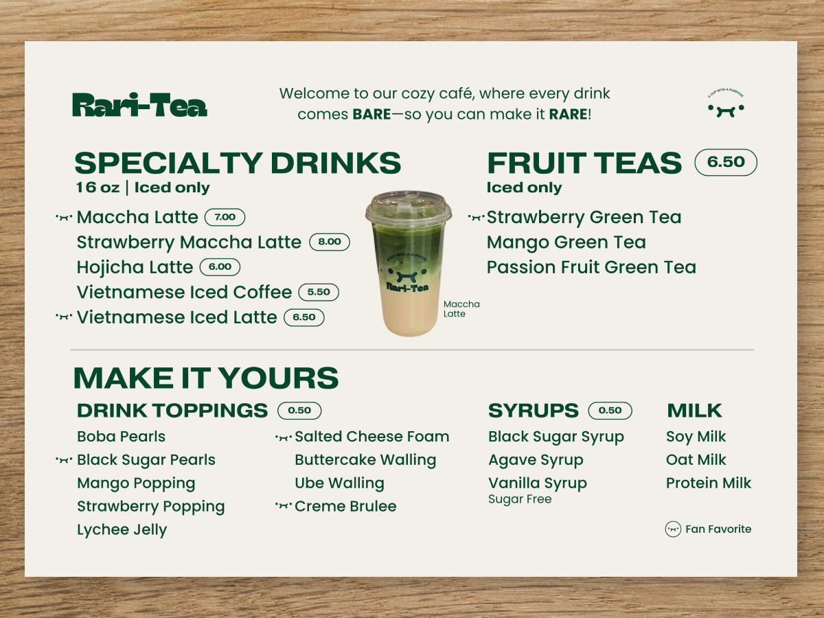
MENU SYSTEM
Redesigned menu and in-store boards built around the type hierarchy.
· Category structure. Drinks, fruit teas, milk teas, smoothies, and food separated by hierarchy, not graphics.
· Readable at distance. Sizing and contrast tuned for in-store boards and fast scanning.
· Personality kept. Brand elements support the content instead of crowding it.
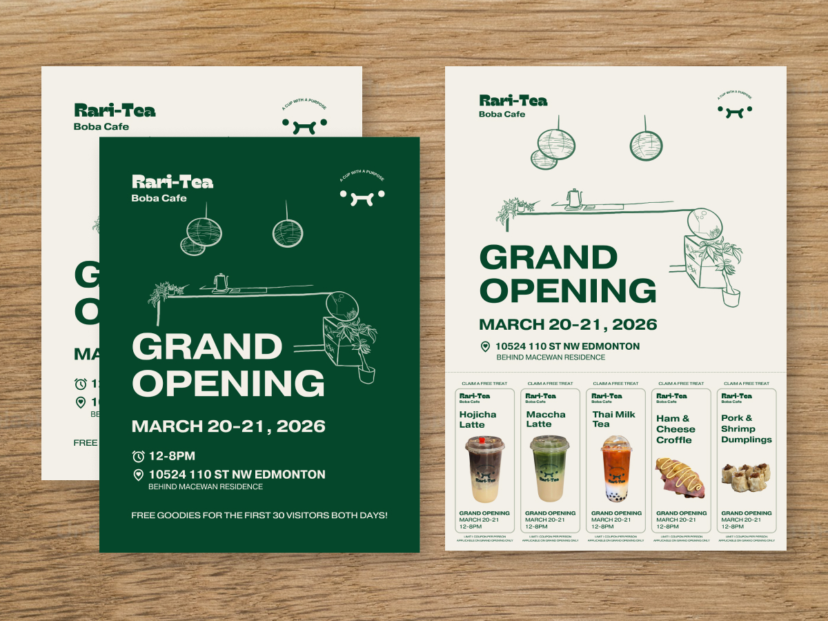
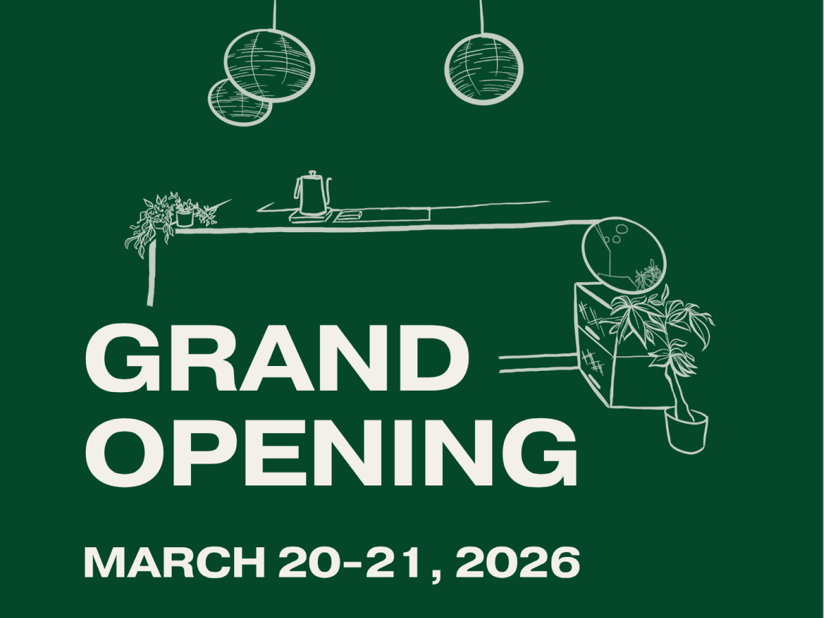
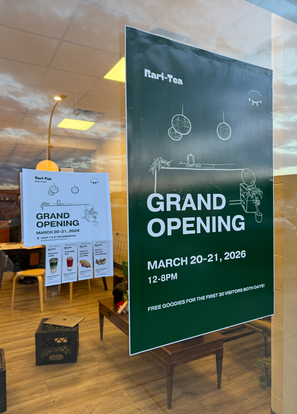
GRAND OPENING CAMPAIGN
A coordinated launch kit to announce the second location.
· Flyers. Large typographic headlines in light and dark versions for different placements.
· Take-one coupons. Detachable tabs that turn a flyer into a physical brand interaction.
· Storefront signage. Large-format window graphics built for street visibility.
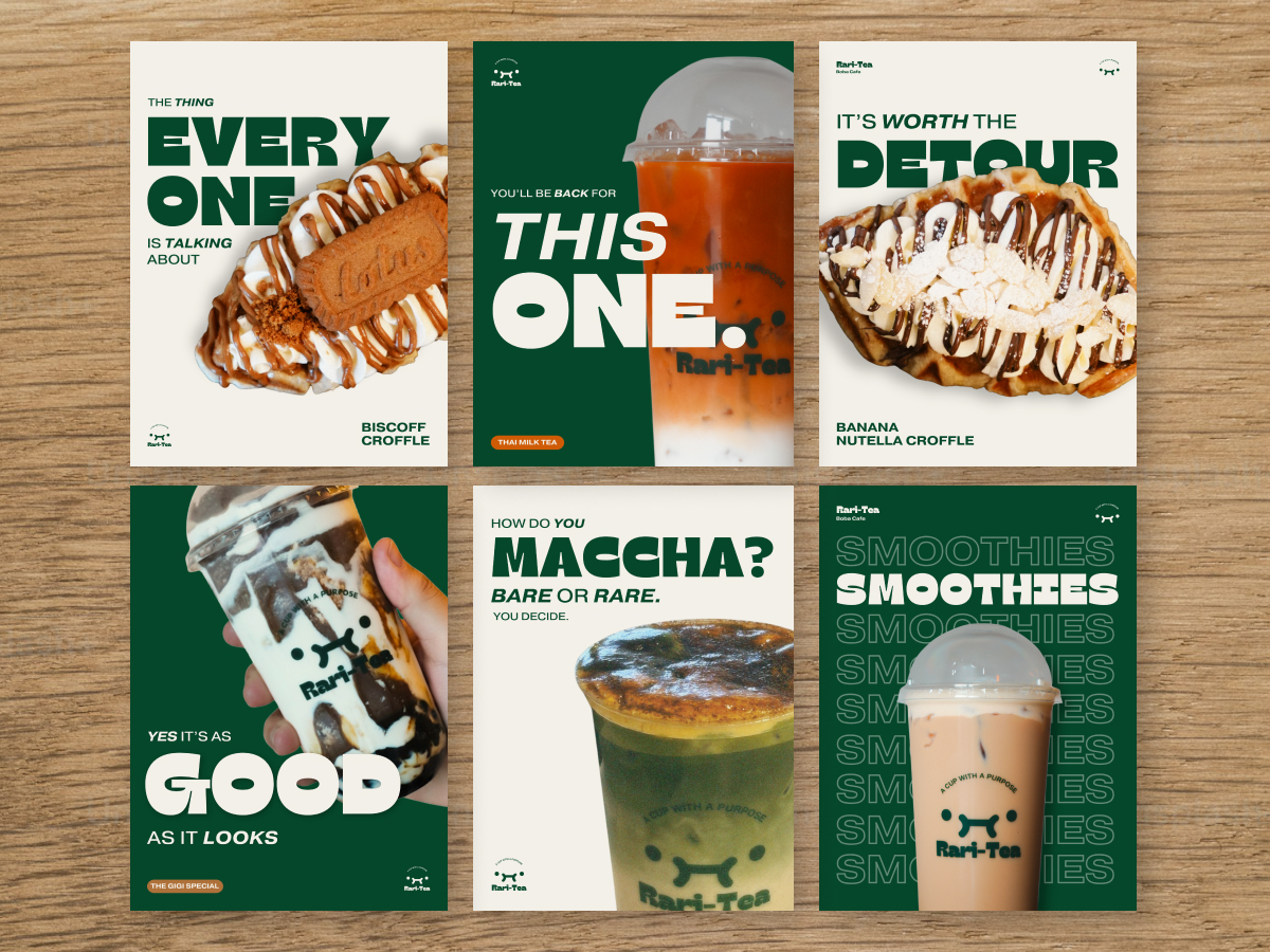
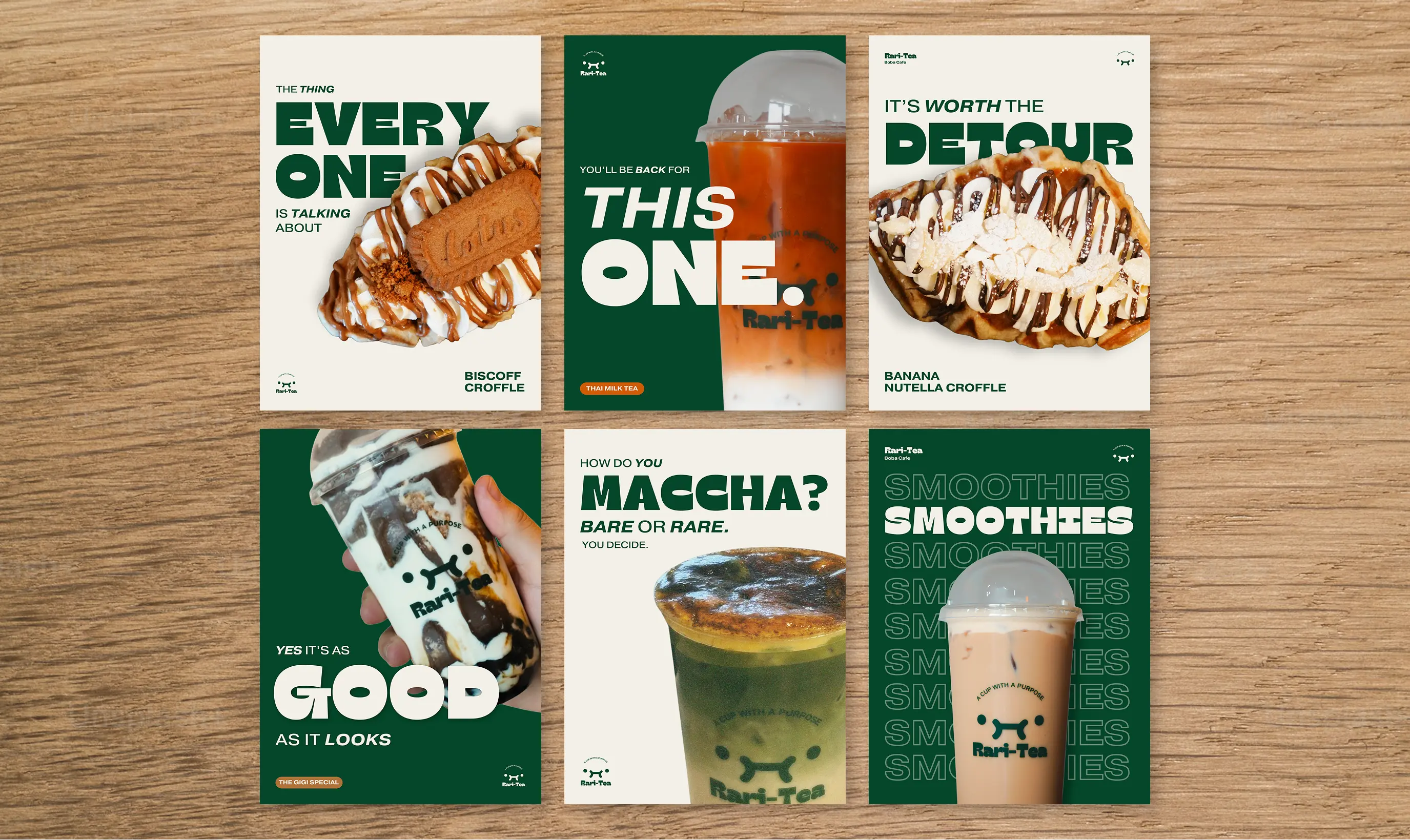
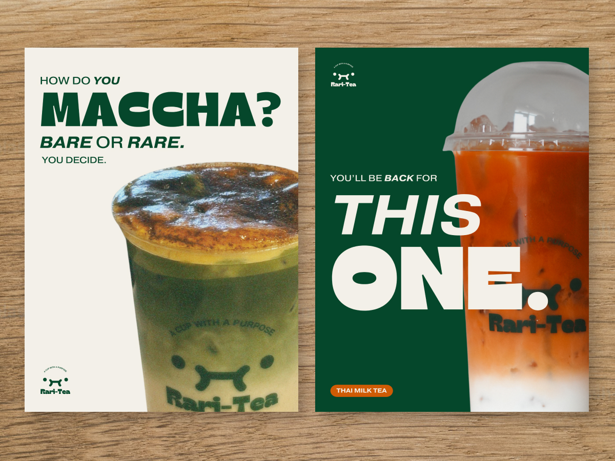
POSTER SERIES
An ongoing promo system that helps customers picture menu items.
· Product-first layouts. Client-supplied photography sized large and cropped for impact.
· Short bold headlines. Lines like "It's Worth The Detour" carry personality without long copy.
· Repeatable framework. Shared type, logo placement, and composition keep new posters on-brand.
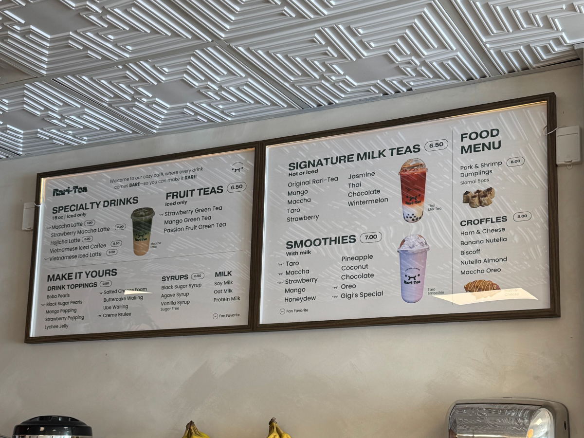
IN THE SPACE
The system installed and in daily use across the café.
· Shipped, not concept. Boards, signage, and posters printed and mounted in the working space.
· Customer-facing. Photographed in real use, from the storefront to the counter.
· One coherent brand. Every touchpoint reads as the same system.
This is shipped client work, not a concept. The menu, in-store boards, launch campaign, and poster series were printed, installed, and used across an active café.
Systems over one-offs. I built a repeatable framework so the café can keep producing on-brand promotions without a designer.
Initiative on scope. Hired for a menu, I identified the bigger need and proposed the full system that shipped.
Craft under constraints. Every decision answered to print, viewing distance, and fast retail use, not just the page.