
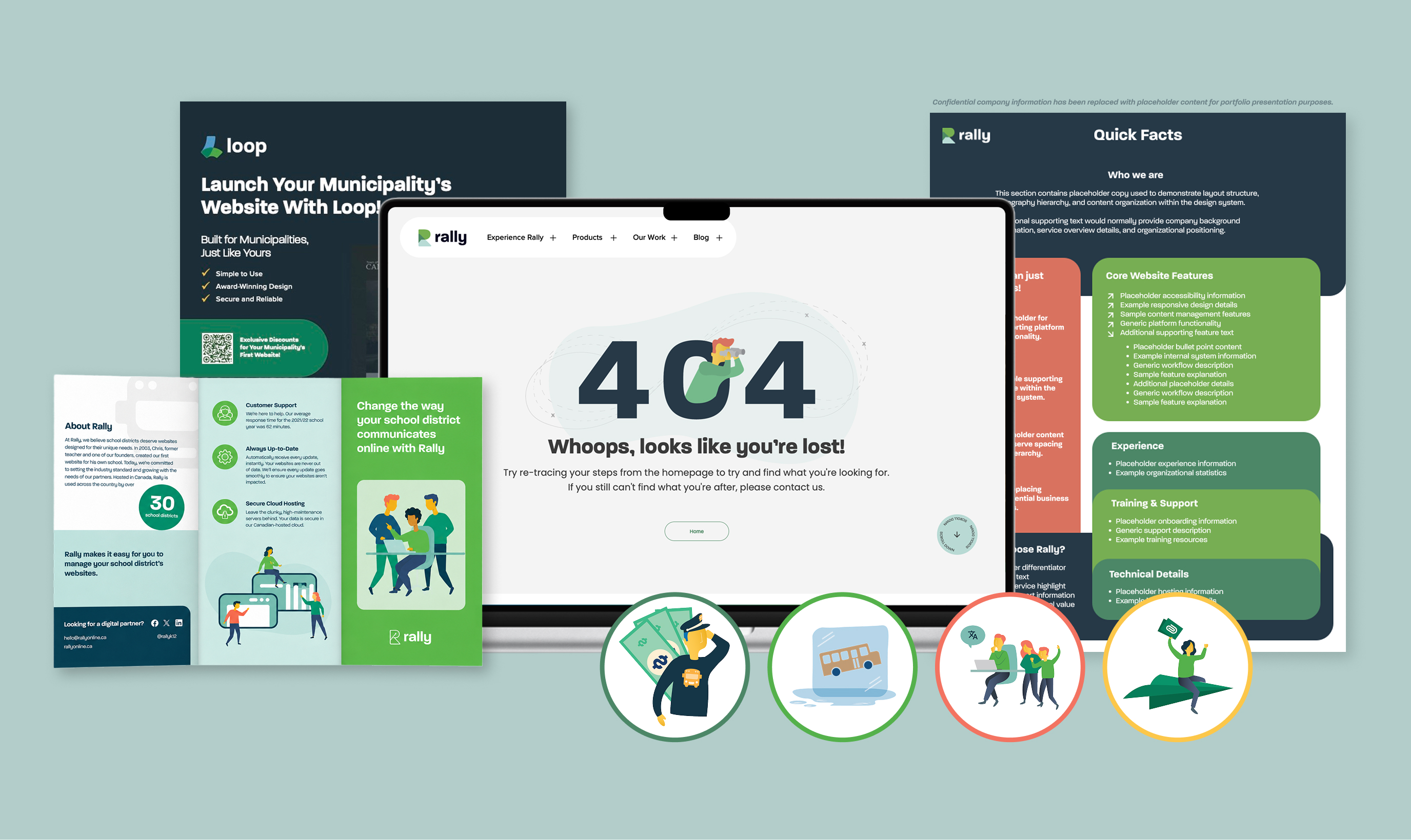
Production design across two sub-brands of Box Clever, plus an illustration system that became the team’s default workflow.
Box Clever is a web design agency with two sub-brands: Rally (K-12 school district websites) and Loop (municipal websites). Both needed a steady output of marketing collateral and illustrations, fast. Most illustrations had a one-to-two hour turnaround. Collateral ran about five hours from brief to print-ready.
My job was to produce on-brand work quickly, across two distinct identities, without breaking either one. The brands already existed and the visual systems were set. Over the year I designed collateral like brochures, fact sheets, promotional postcards, a 404 illustration, and built out the team’s illustration library.
The rebuild moved in four stages, each tied to a specific brand problem.
Brand Document
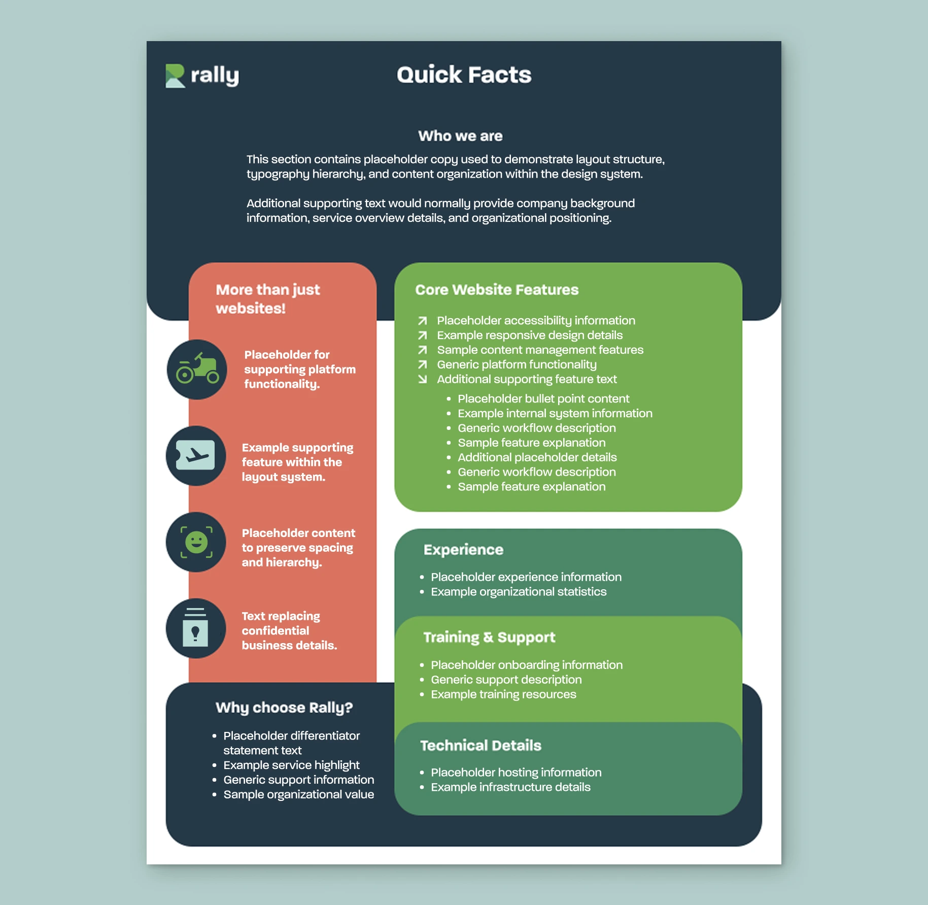
Quick Facts Sheet
A one-page reference document organizing Rally’s product features, experience, and technical details. The challenge was fitting a high volume of content onto a single page without making it feel cramped or hard to scan.
Print Collateral
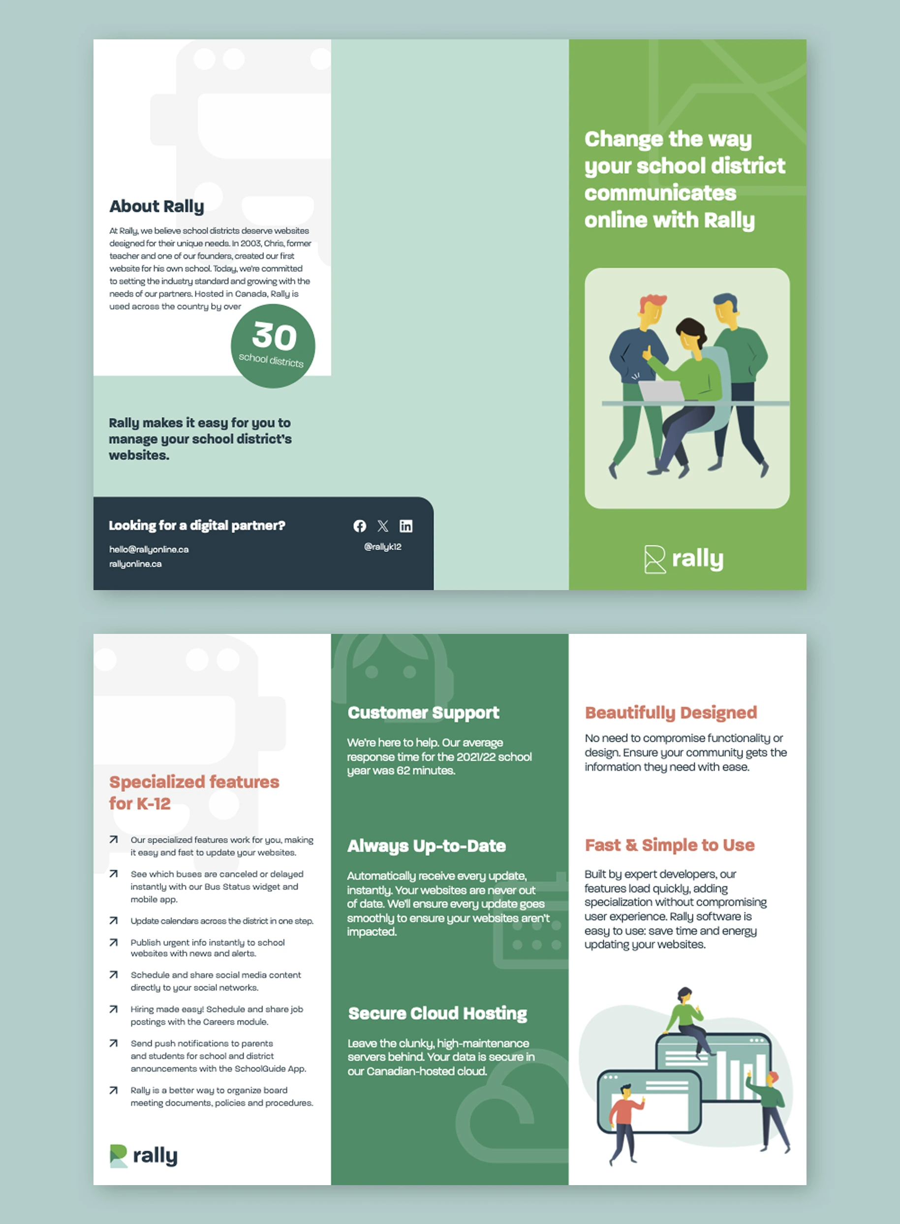
Rally Brochure
A trifold brochure for school district decision-makers. Designed to introduce Rally’s platform at conferences and sales meetings, balancing dense product information with the brand’s friendly, approachable visual identity.
Web Illustration
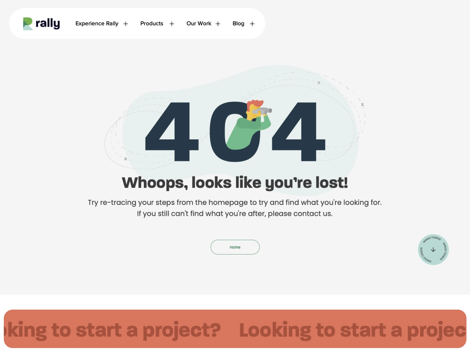
404 Page Design
A custom illustration and design for Rally’s 404 page. The brief was to keep users oriented and on-brand when something broke, instead of letting a dead page feel like a dead end.
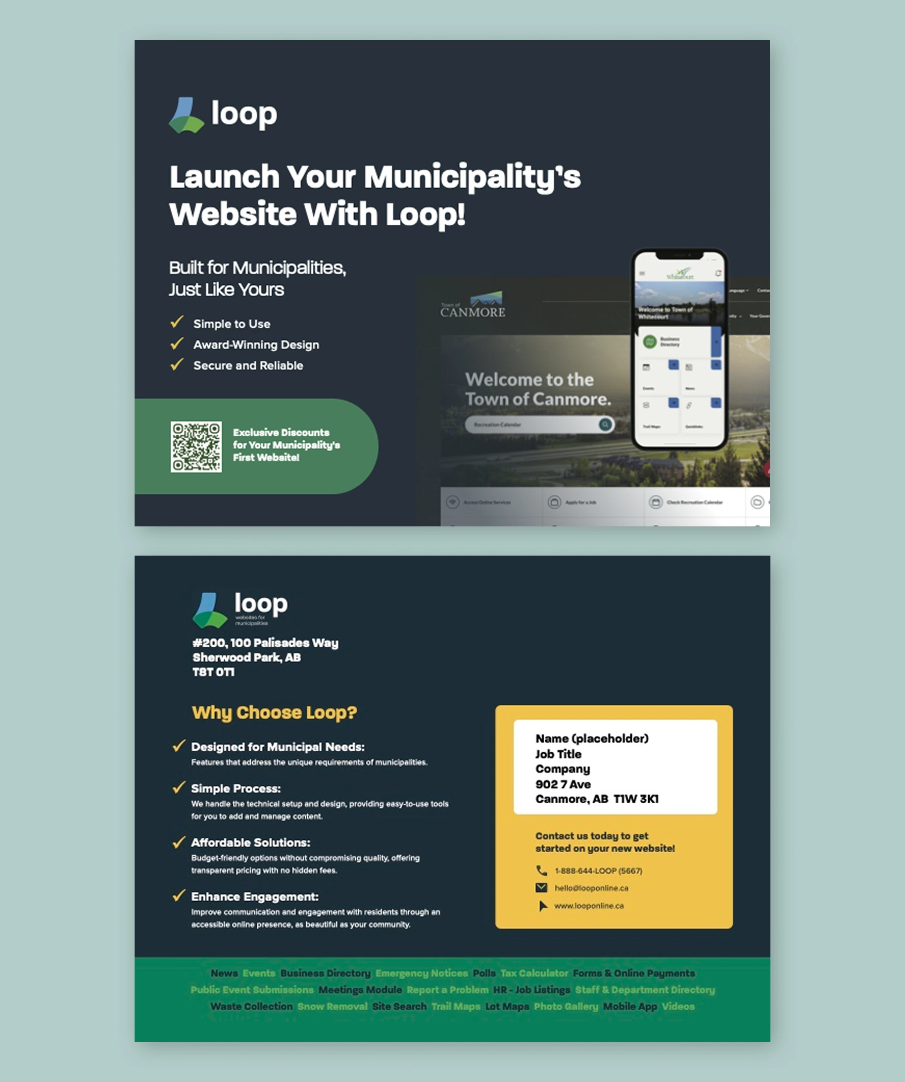
Promotional Print
Loop Launch Postcard
A direct-mail postcard introducing Loop to municipal decision-makers. Designed in Loop’s darker, more institutional palette to match its audience while keeping the layout punchy enough for a quick read.
Illustration work at Box Clever lived across years of unsorted files. I built the Rally Illustration Library to fix that, and it became the team’s default workflow.
The Problem
For years, Rally illustrations had been built ad-hoc, every new one starting from scratch on a one-to-two hour clock.
· No central source. Illustration assets lived in a flat folder of unrelated Illustrator files.
· No shared workflow. Each designer approached illustration differently, which made hand-offs and style consistency a recurring problem.
· No reusable parts. Characters, props, and backgrounds were drawn fresh for every brief, even when near-identical versions already existed.
The Solution
Every Rally illustration consolidated into one labeled file. New work is remixed from existing parts, the way a child builds an outfit in a dress-up game.
· One source of truth. Every Rally illustration component lived in one organized, labeled file.
· Consistent visual language. The team produced on-brand illustrations without re-deciding the visual rules each time.
· Remix over redraw. New illustrations started from existing parts, cutting turnaround time noticeably.
Most illustration work had a one-to-two hour turnaround. Collateral pieces ran about five hours from brief to print-ready. Page sizes were fixed but the content was rarely light, so layout decisions came down to hierarchy and restraint more than space. Across both Rally and Loop, the design had to read as on-brand on first glance, even when the brief was new and the deadline was the same day. Most of the inherited material was unorganized too, which meant part of the job was sorting through old files to find what existed before I could decide what to make next.
The year taught me how to design fast without designing thin. Most briefs came with the deadline already set and the content already messy. The work I’m proudest of from that year is the Rally Illustration Library, because it’s the only piece that kept paying off after I shipped it. The deliverables themselves taught me craft. The system taught me to look one step past the brief.
Hierarchy beats space. Early on, my instinct for dense pages was to shrink type and squeeze margins. Mentor feedback taught me that the fix is almost always structure, not size. The Quick Facts sheet was the piece where this finally clicked.
Decoration is a tax. I learned to ask whether every visual element was earning its place, especially on collateral where the content was already doing the heavy lifting. Some of my earliest drafts had too much going on. Others had too little. Finding that line was the year’s most useful skill.
Look one step past the brief. The illustration library wasn’t asked for. It came from noticing a repeated frustration on the team and treating it like a design problem instead of a workflow complaint. The discipline I want to carry into product design is exactly that one.