
A 20-page municipal plan rebuilt into a readable report, unified by one connective device pulled from the wordmark.
Edmonton's strategic plan had strong content but read as a wall of text. The problem was structural: a long document with no system to carry a reader through it.
Flat hierarchy, disconnected spreads.
An editorial redesign of an existing city document. The content was the city's; my job was making 20 pages cohere and scan as one designed object. A layout problem, not a content one.
Four moves took the report from a flat document to a connected system.
Audited the original to keep what worked: the connected theme and a custom icon set. Fixed structure, hierarchy, and pacing.
Built a grid that flexes across text- and image-heavy spreads. Pulled a path from the wordmark to thread every spread together. Negative space planned, not improvised.
Printed type tests at size to check hierarchy on paper, not screen. Printing exposed weight and scale problems the monitor hid. Locked the type system from these proofs.
Across three crits the flatplan tightened and the data spread was rebuilt. Simplifying the visualization made dense numbers read at a glance.
Four layout systems carry the report.
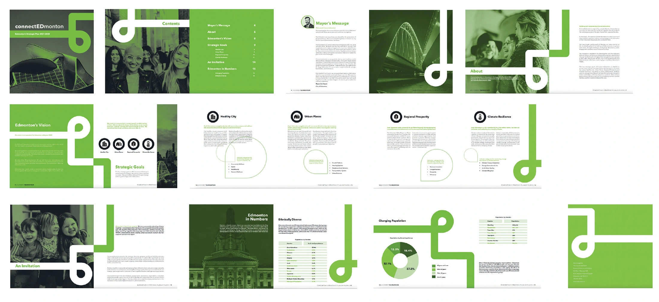
COHESION DEVICE
A single path, pulled from the wordmark, threads every spread.
· System over decoration. Doubles as wayfinding and a unifying motif, so 20 pages read as one.
· Drawn from the brand. Pulled from the connectEDmonton mark, tying the system to the brand.
· Consistent placement. A predictable anchor through a long format.
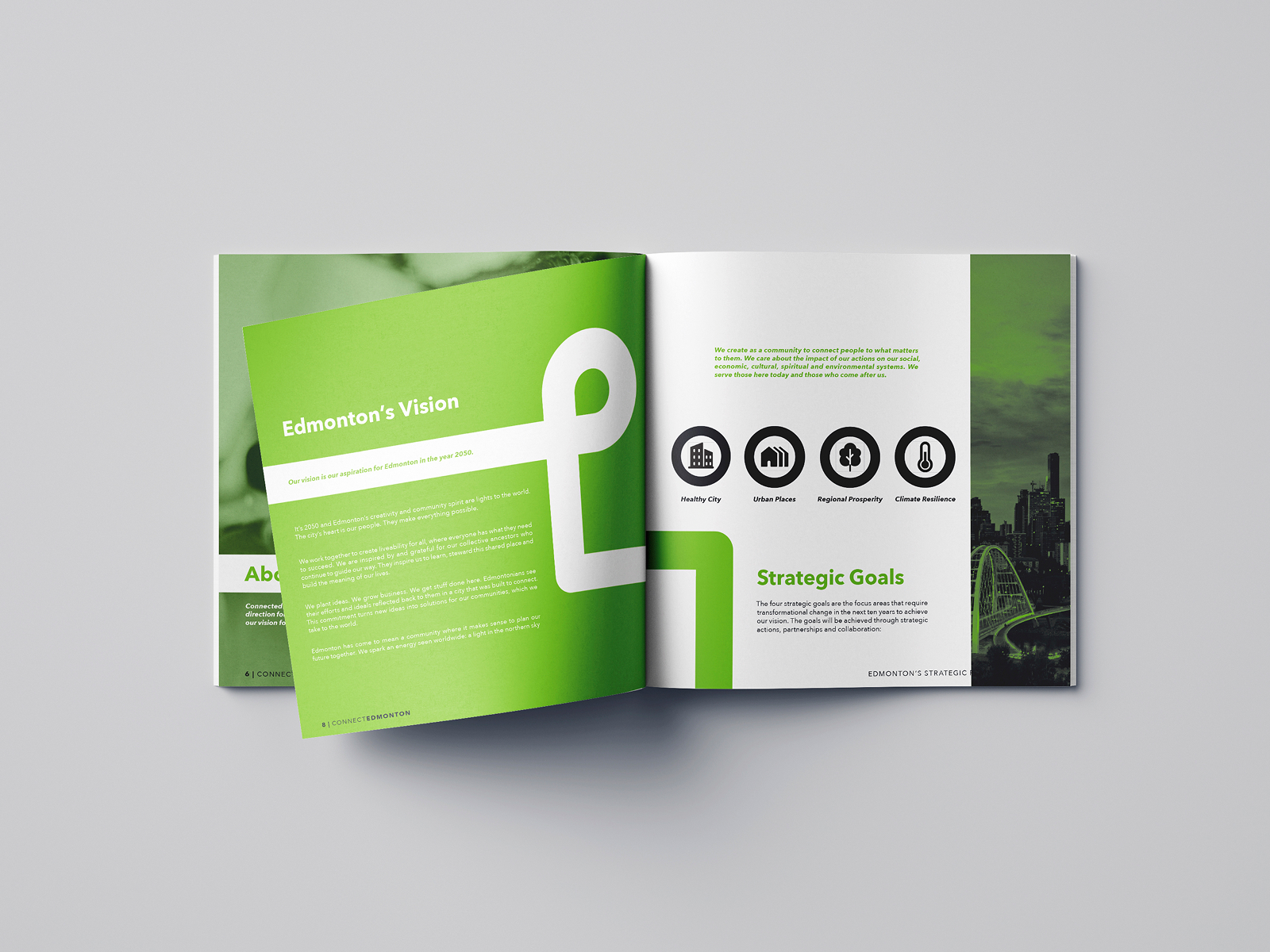
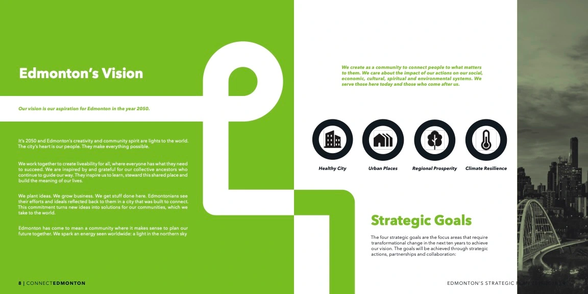
PARALLEL STRUCTURE
Four strategic goals built to scan identically.
· Equal weight. Same scale and spacing, so none outranks another.
· Icons I designed. Custom icon set, consistent container and hierarchy.
· One scan pattern. A reader absorbs all four at the same speed.
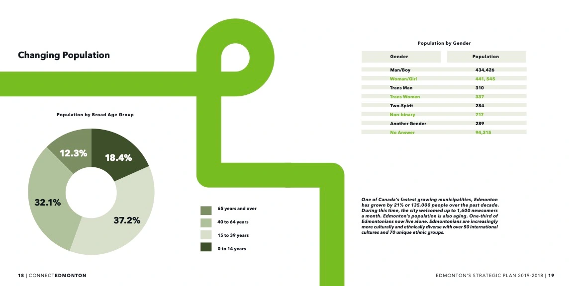
DATA CLARITY
Census and demographic data inside a two-color limit.
· Restraint as a constraint. Two Pantones only, so data reads through tone and form, not color coding.
· Chart plus table. Donut chart plus population table: quick reads and detail.
· Legibility first. Simplifying it made the densest spread the clearest.
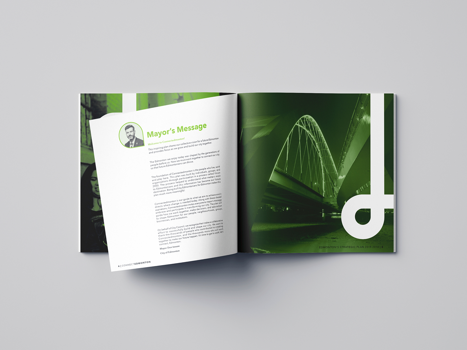
TYPOGRAPHIC HIERARCHY
A long aspirational passage held by type and space.
· Reversed type, controlled. Reversed type on a green field, kept readable with tight leading and margins.
· One accent, no clutter. Hierarchy comes from scale and weight, not added graphics.
· Space does the work. Negative space paces the passage so dense copy feels deliberate.
Editorial design is a systems problem, not a page-by-page one. The redesign gave a flat 20-page plan one clear reading system, built in a month under a two-color limit.
What worked. The connector gave the report a spine readers follow without instruction.
What I'd change. Solve the data visualization earlier, not in the final crit.
What it taught me. Constraints sharpen layout decisions rather than limit them.