
A shipped website redesign for the Manitoba Association of School Superintendents. Restructured a dense, content-heavy site into a clear, modular system in one month.
The MASS website was dense, fragmented, and hard to scan. The brief: improve clarity and usability inside the existing brand and framework, on a one-month timeline.
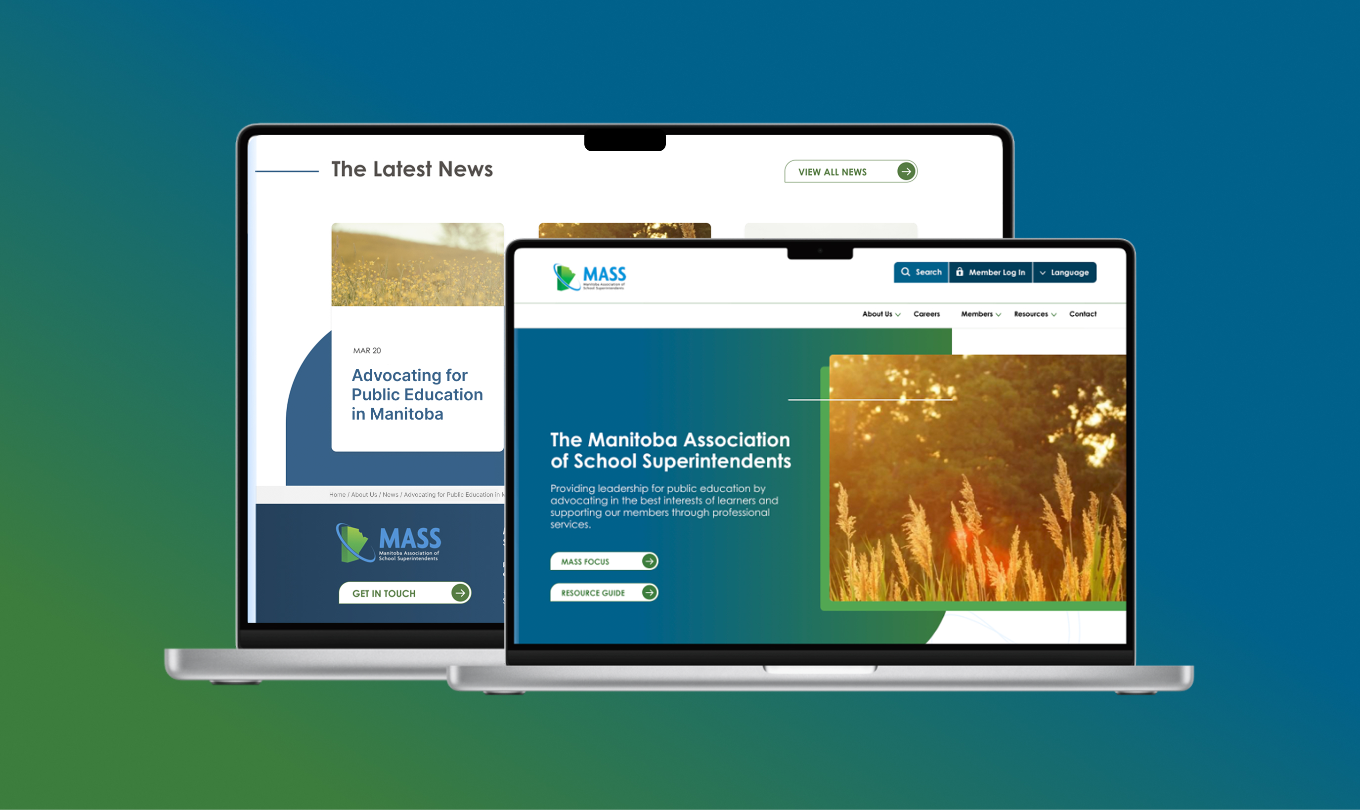
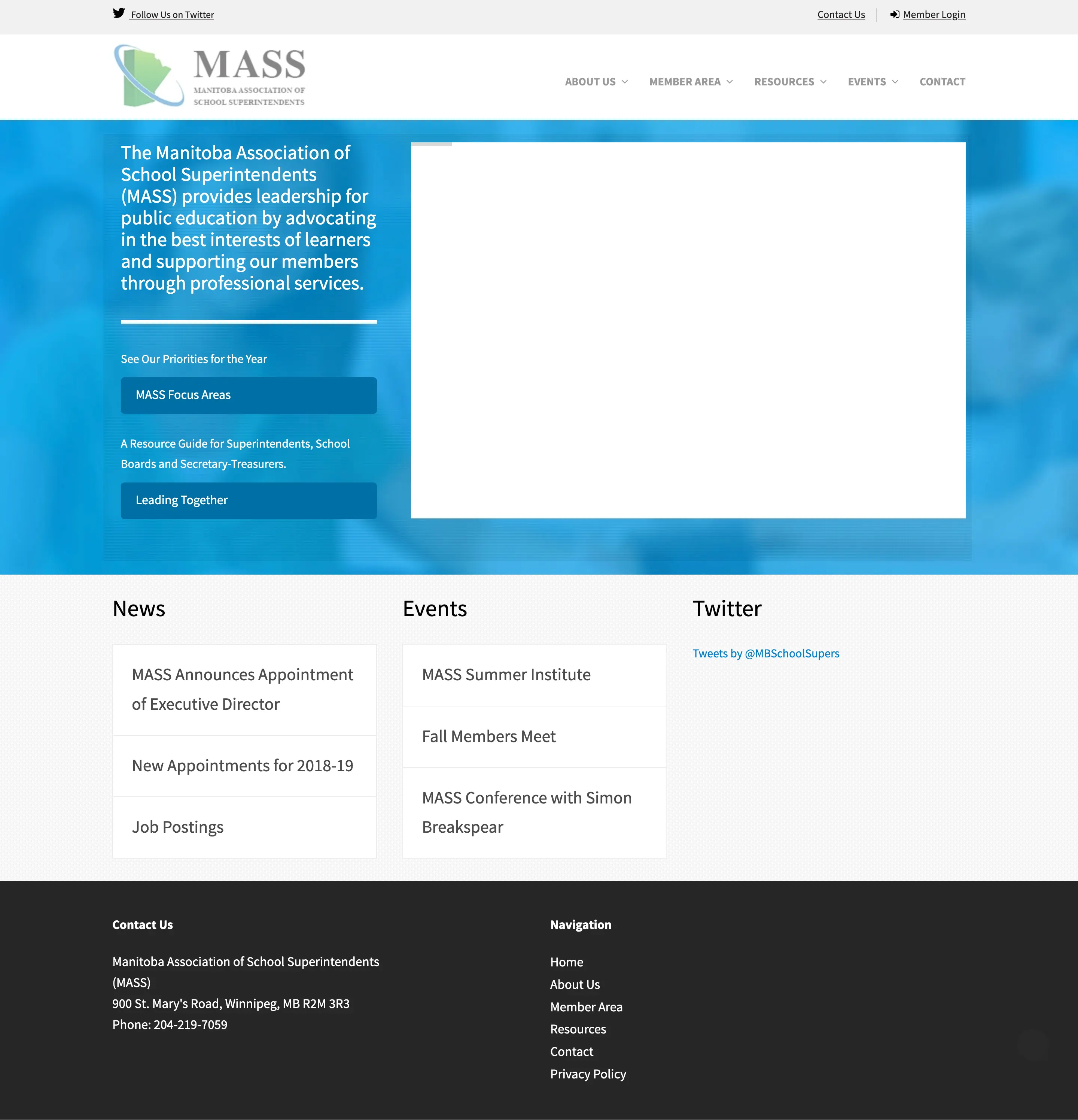
Before
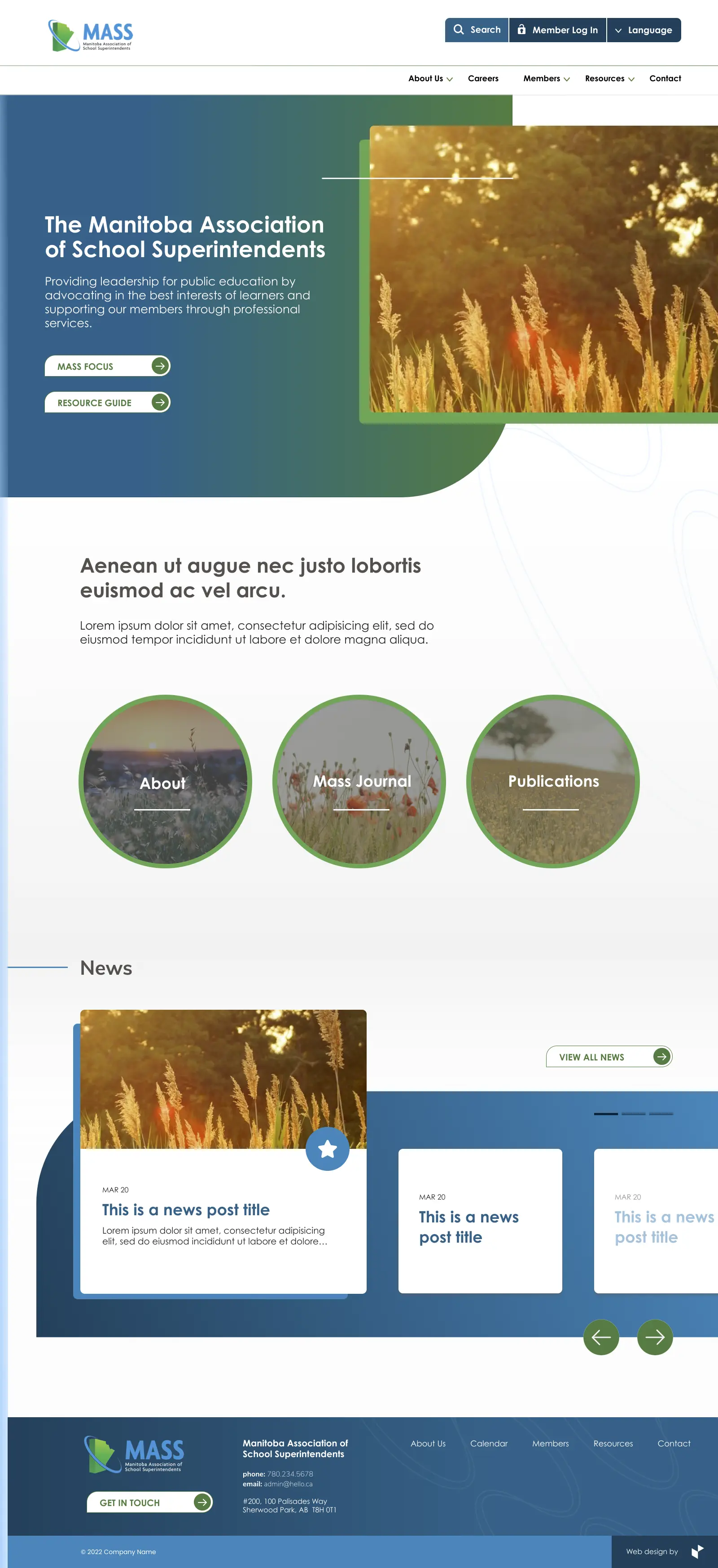
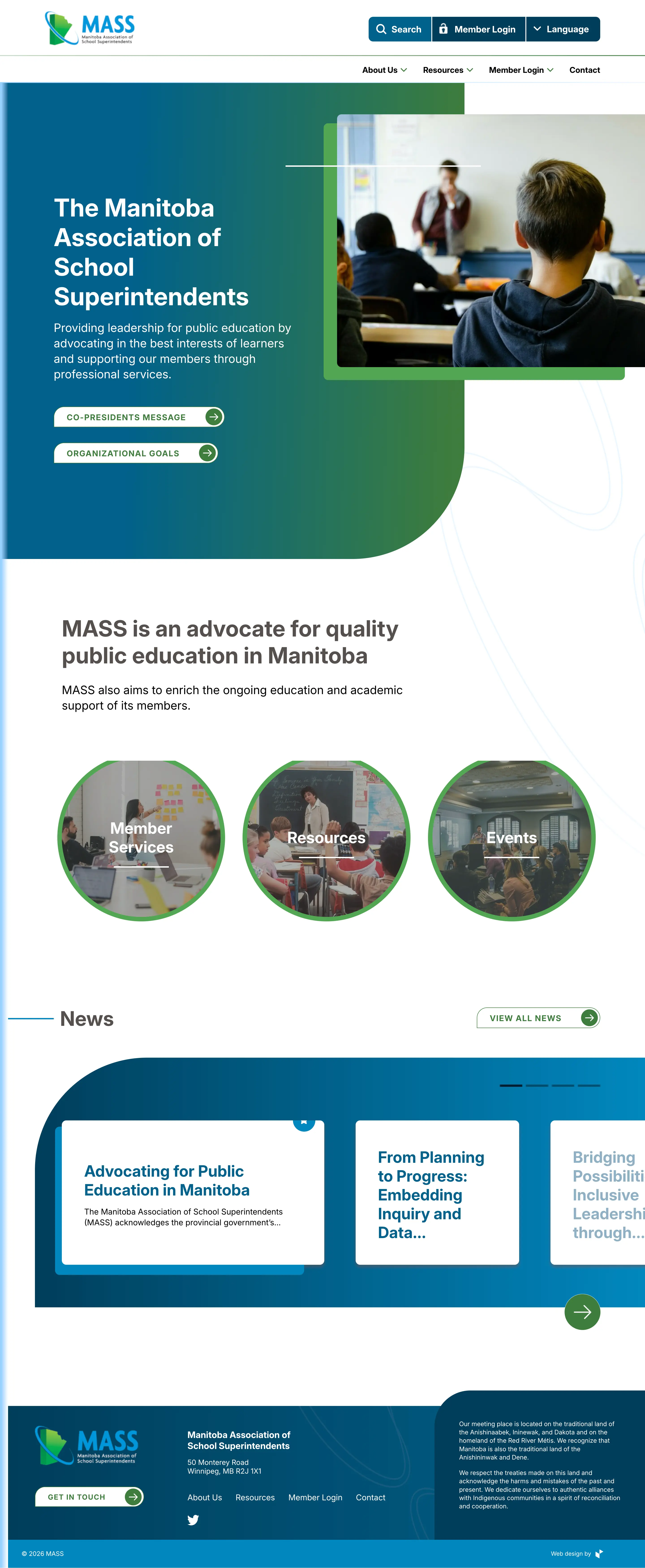
After
Two weeks of design, two weeks of implementation with development. I focused on structural decisions that could scale inside the existing framework. The goal was clear hierarchy. Grouping content logically, repeating patterns consistently, and helping users find what they need faster.
One-month turnaround, an existing internal framework, and locked brand guidelines. The redesign worked with these to ship on time without scope creep.
Reorganized dense pages into clear, layered layouts so users can scan, locate, and act without reading every line.
Built a small set of reusable card, list, and section patterns so a content-heavy site could scale without inconsistency creeping back in.
Worked directly with the PM and developer through implementation. Made structural calls in real time so the build matched the design intent.
The redesigned site leads with hierarchy. Three pages carry most of the weight.
Screen 01
Sets the visual direction and surfaces the three main pathways into the site.
· Modular hero composition. Asymmetric image treatment and layered shape language give the brand a confident, contemporary feel without rebuilding the identity.
· Two-action hierarchy. Primary entry points sit directly in the hero so the most-requested links are one click from arrival.
· Pathway cards. Member Services, Resources, and Events surface the three highest-traffic sections immediately, reducing reliance on the main nav.
· News module. Featured-post styling and a carousel keep recent content visible on the homepage without crowding the modular structure above it.
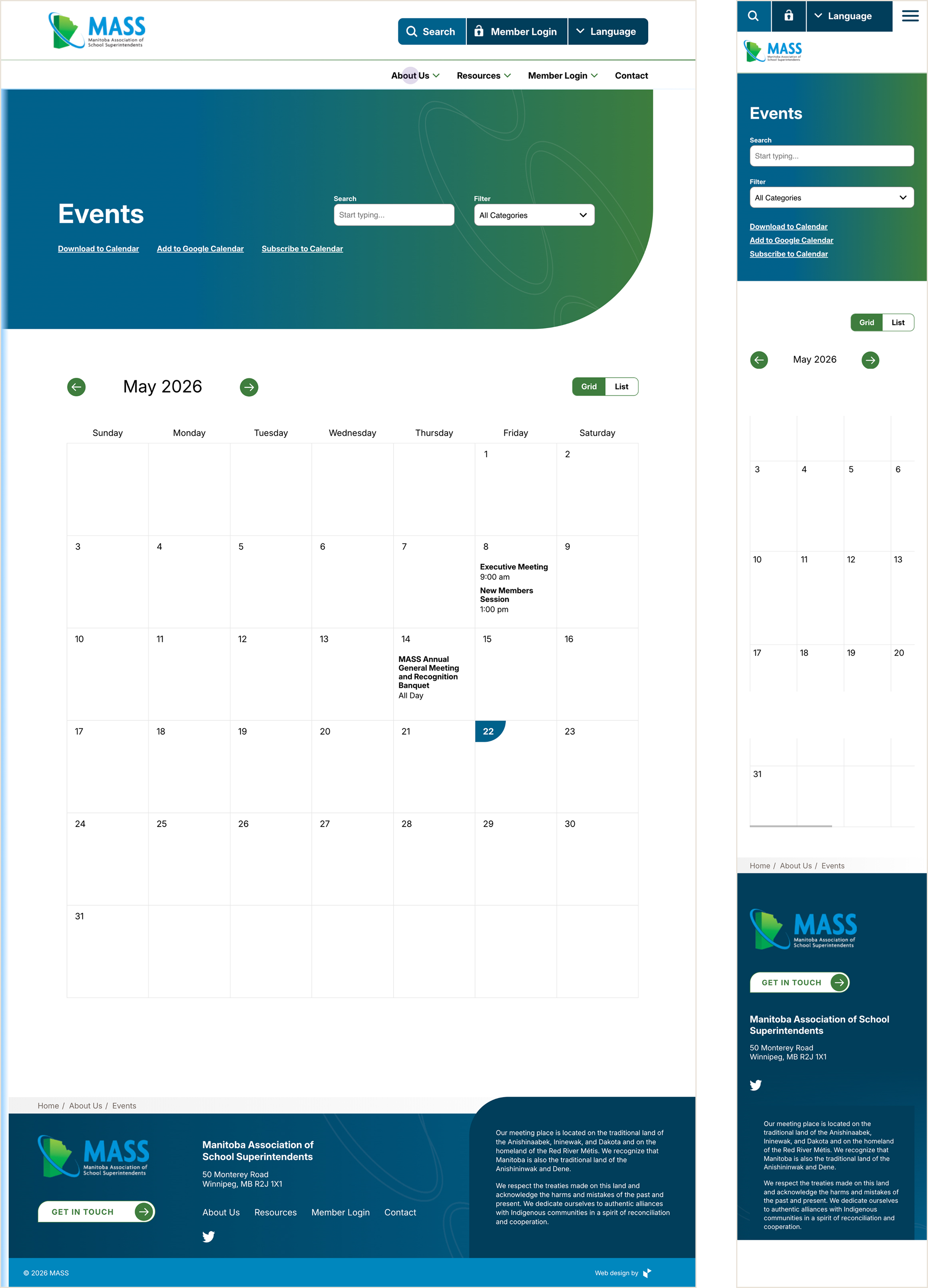
Screen 02
The most functional page in the build. One system handling search, filtering, two view modes, and a calendar grid, restructured cleanly from desktop to mobile.
· Search and filter in the hero. Both controls live inside the gradient banner so users start interacting with the page immediately, not after scrolling.
· Grid and list toggle. A segmented control lets users switch between calendar overview and a chronological list without losing context.
· Calendar grid with today indicator. A subtle shape marks the current day, giving users a quick visual anchor inside a dense month view.
· Calendar export options. Download, Google Calendar, and subscribe links sit at the top of the page so members can move events into the tools they already use.
· Responsive without compromise. On mobile, the header collapses to icons, filters stack vertically, the toggle stays tappable, and the calendar grid scrolls horizontally to preserve the seven-day week.
Shipped on schedule and replaced the live site in production. The strongest result was structural. A dense content library made navigable inside a framework and brand that couldn't be rebuilt from scratch.
Shipped under real constraints. Delivered a live client redesign in one month, inside an existing framework and fixed brand, without compromising structural quality.
Hierarchy did the work. Scannable hierarchy, modular sections, and tag-driven libraries reduced cognitive load without relying on custom components.
Production-ready handoff. Worked alongside the PM and developer through implementation so the version that shipped matched the version that was designed.