
A brand identity system for a social reading community, built from how readers actually mark up their books.
Roundtable began as a structured book club, then shifted toward casual creative sharing like moodboards, quote posts, playlist pairings. The concept moved, the visual identity did not. Early screens still read like Goodreads; clean, utilitarian, emotionally flat.
The brand was solving the wrong problem. It needed warmth and expression that matched how readers engage with books, not a productivity look borrowed from the apps it was trying to stand apart from. The rebuild had to deliver a full identity system, naming, tone, visual language, and illustration, across an 8-month solo capstone.
The rebuild moved in four stages, each tied to a brand problem. The goal was not a prettier screen, it was a visual system that could carry the differentiation the brand needed. Each stage fed the next.
Mapped early screens against the new direction to find where the visual language fought the concept. Layouts mirrored Goodreads density, typography felt clinical, card systems had no personality.
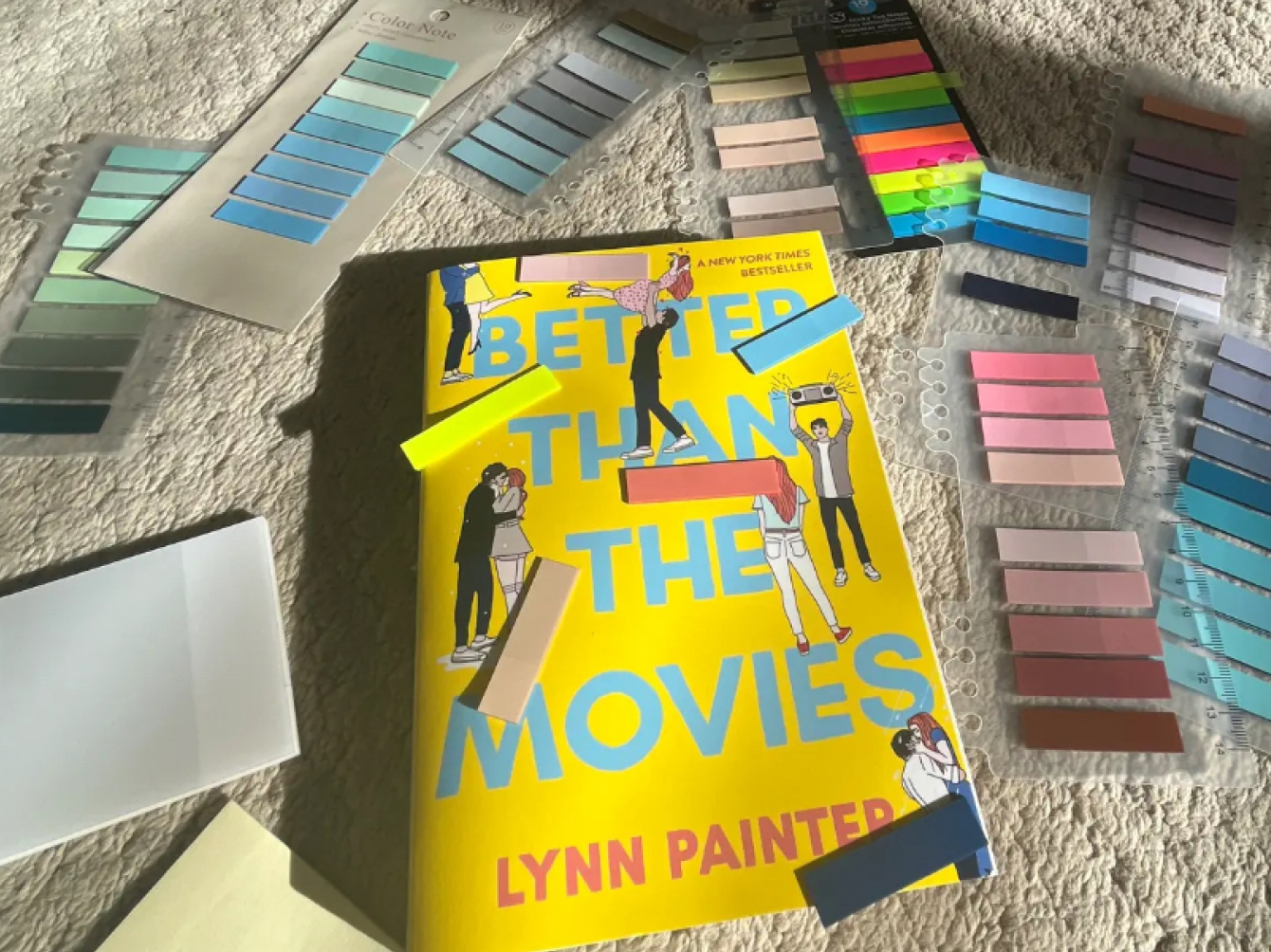
Stopped referencing reading apps. The breakthrough came from a personal habit: colored tabs, highlighters, and margin notes in a physical book. Annotation became the core brand gesture.
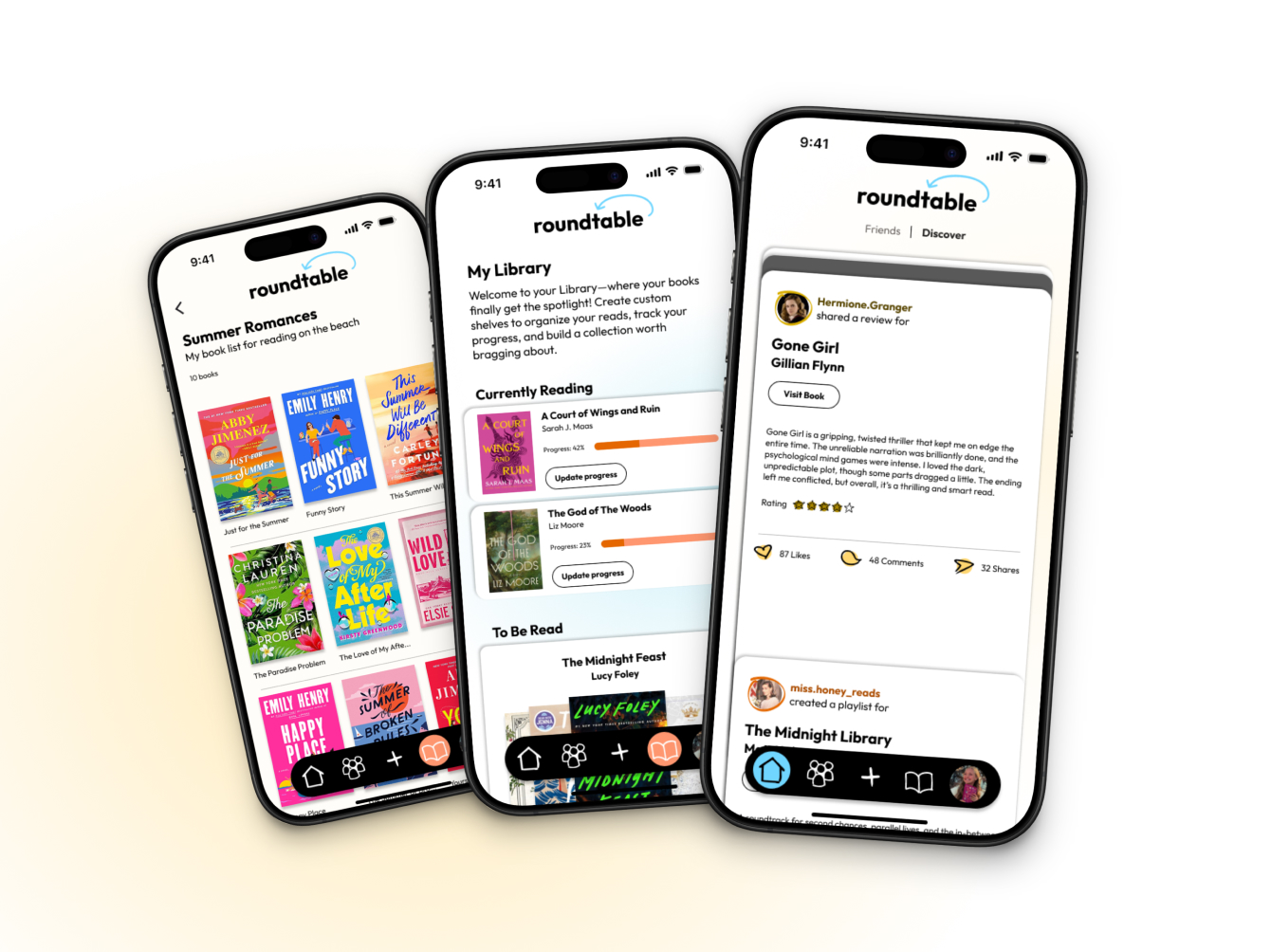
Defined the wordmark, type, color, and hand-drawn marks that work like reader annotations across the system. Outfit handles all type; a five-color palette adds warmth without losing clarity; editorial card layouts carry dense book content without fatigue.
Applied the system across feeds, book pages, creative posts, and spoiler views. Refined through weekly critique. It held across every content type, the real test: a brand only works if it survives at scale.
Foundation, the system at scale, reader-made content, spoiler handling, and library tracking.
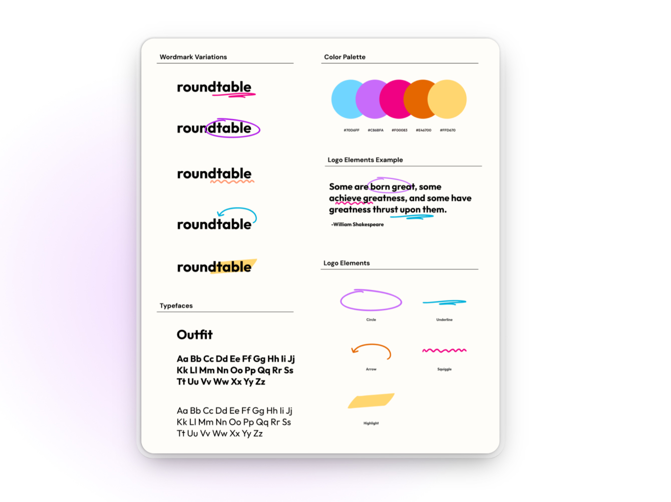
FOUNDATION
The system is built around how readers physically mark up books.
· Wordmark. Lowercase "roundtable" in Outfit, signed with a hand-drawn arrow.
· Five annotation marks. Circle, underline, arrow, squiggle, highlight, the system's core primitives.
· One typeface. Outfit covers everything; the earlier two-typeface system was cut.
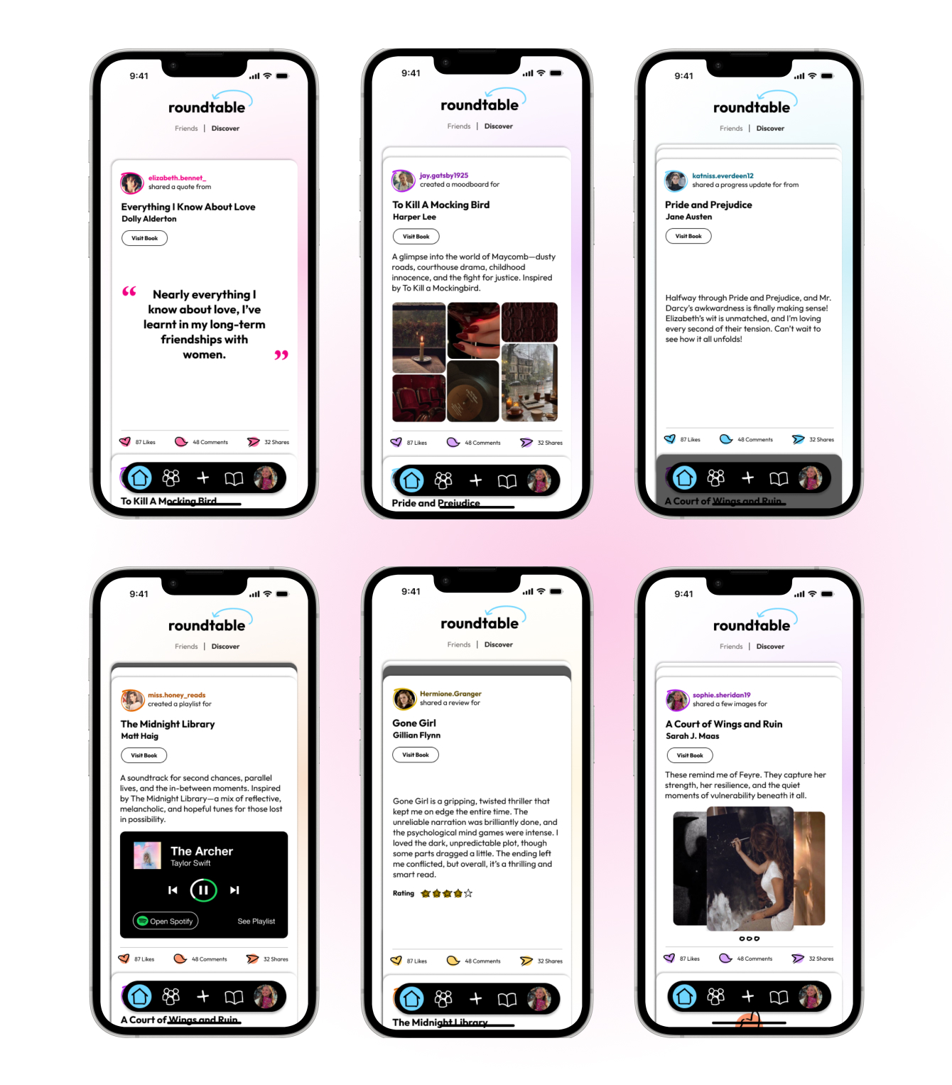
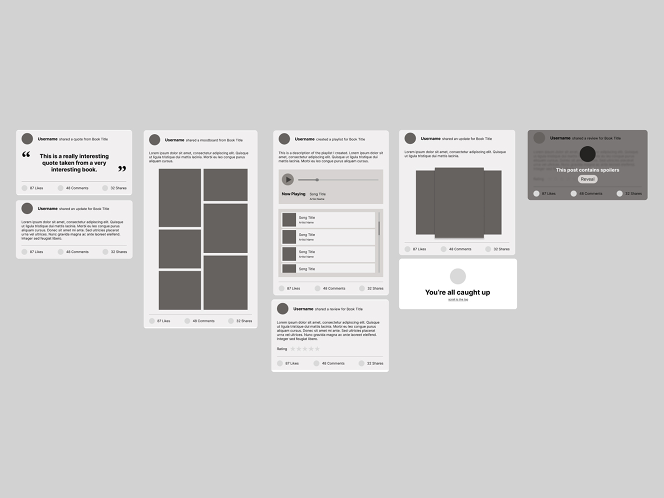
SYSTEM AT SCALE
Five content types in a single scroll, without becoming a wall of text.
· Shared anatomy. Same header and footer on every post type, so the pattern reads fast.
· Content-led variation. Quotes get typography, moodboards get grids, playlists get players.
· Editorial spacing. Generous vertical rhythm avoids dense Goodreads-style fatigue.
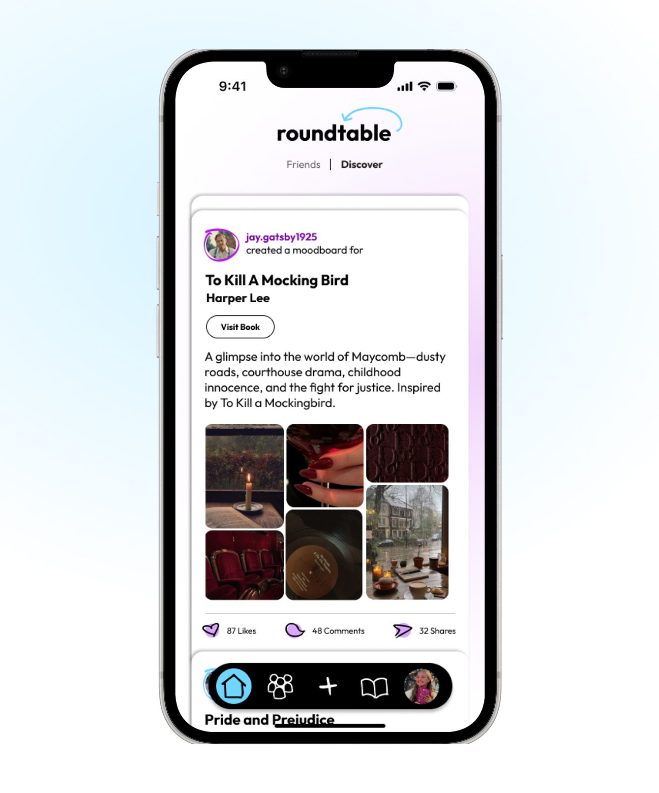
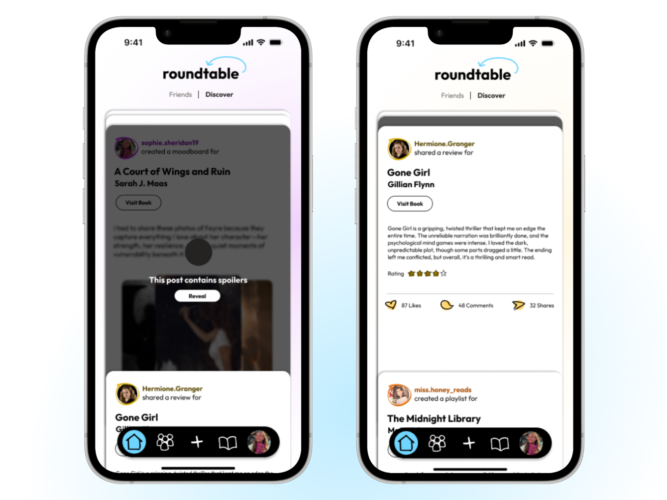
CREATIVE CONTENT
The format treats reader-uploaded imagery as primary content, not decoration.
· Image grid first. Six-image varied layout that reads as composition, not photo dump.
· Caption as context. Short framing line that supports the imagery without competing.
· Visit Book button. Every creative post routes back to the book detail page.
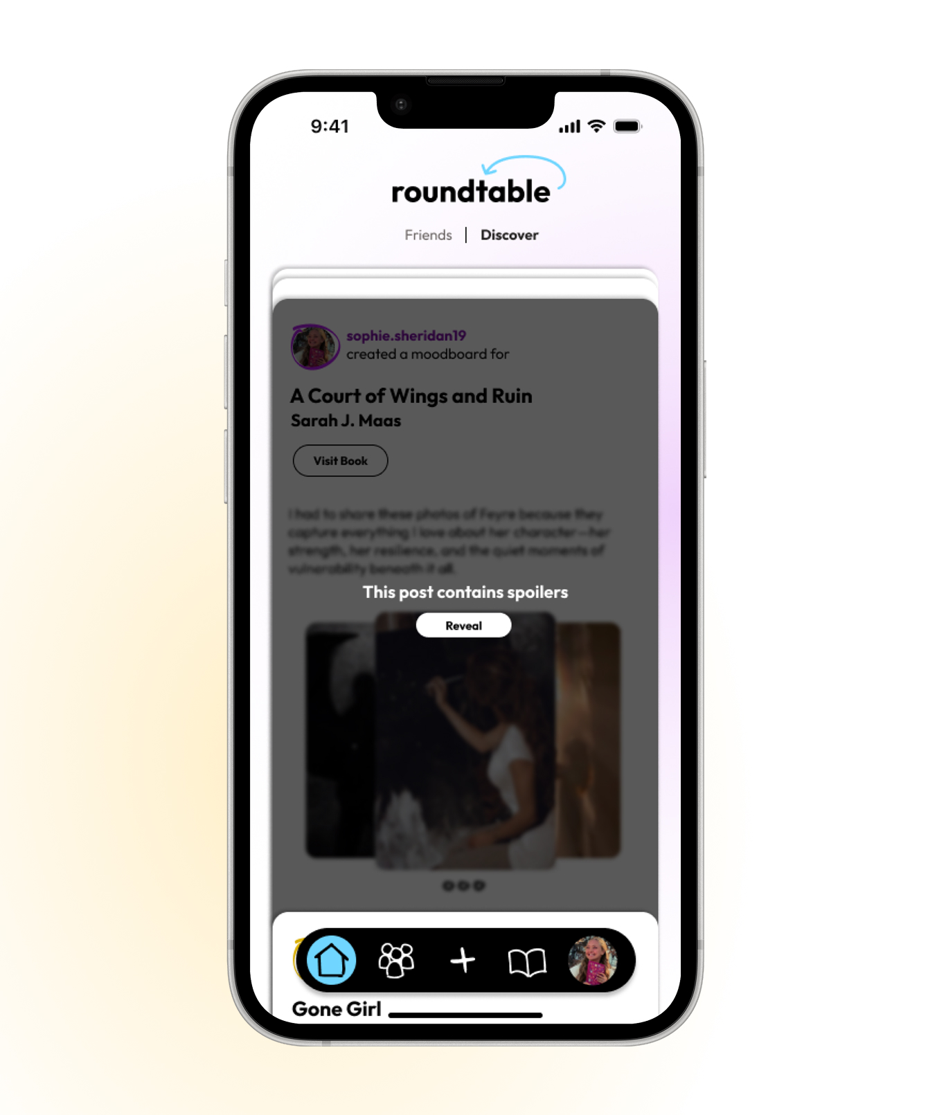
Spoiler handling
Spoiler protection treated as a brand decision, not just a feature.
· Masked content. Soft overlay, not a click-through wall.
· Clear opt-in. Single "Reveal" button gives explicit control.
· Brand consistency. Same card and type system as every other post.
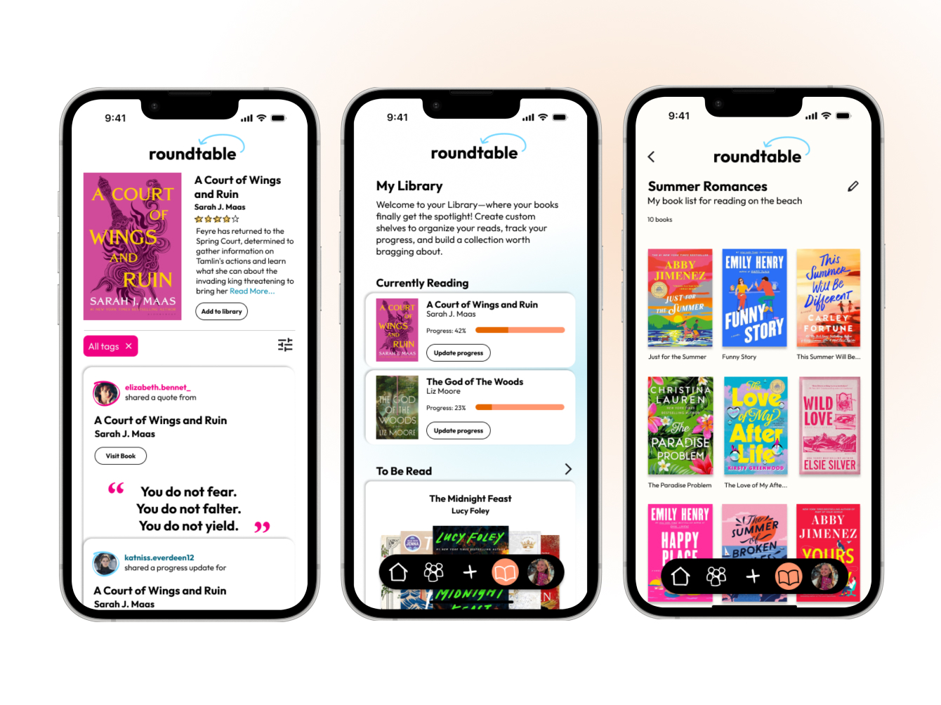
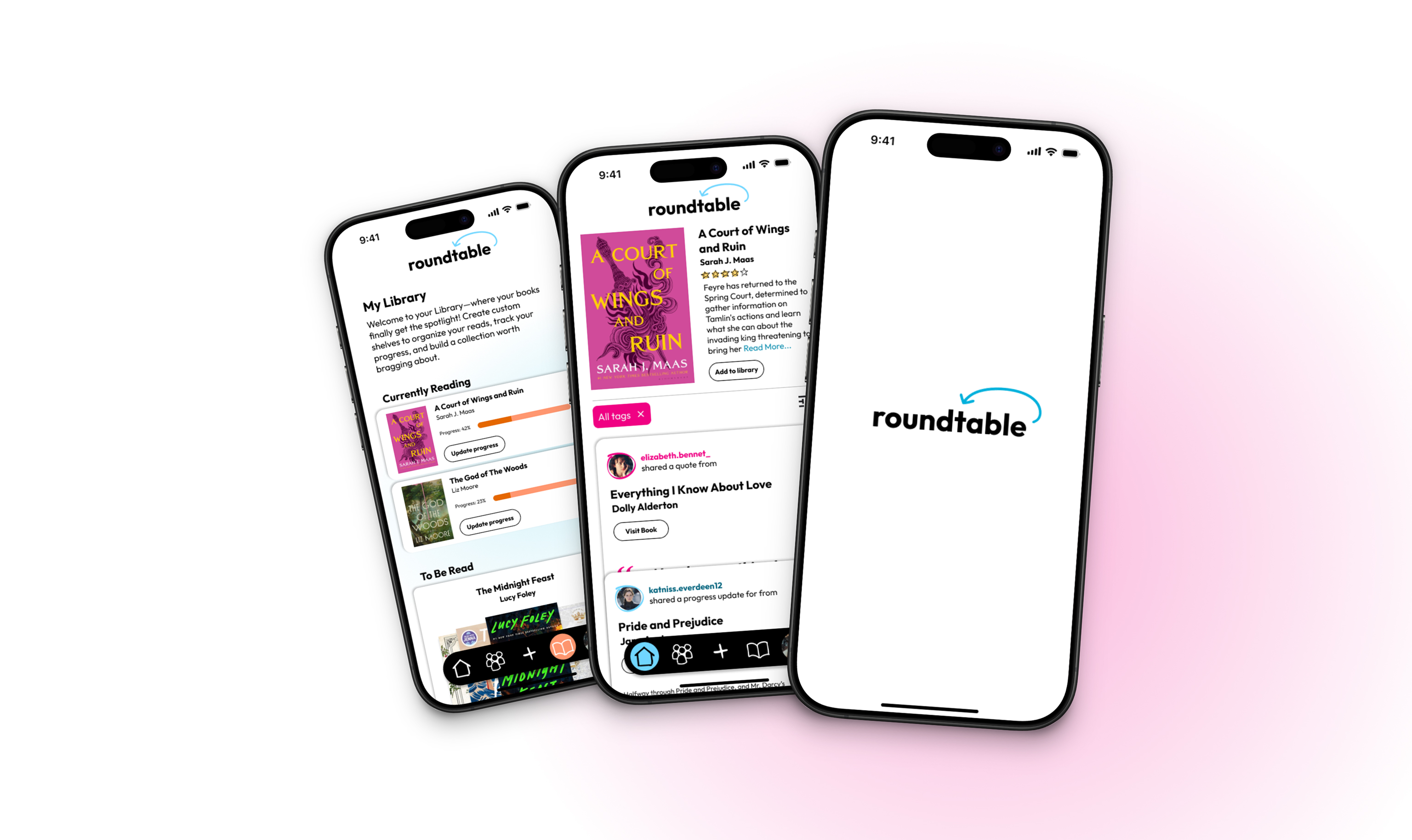
Library & tracking
Tests the system against structured, tracking-heavy content.
· Currently Reading. Progress bars use the brand accent, treating progress as personality.
· Custom bookshelves. Reader-named shelves display as visual collections of covers.
· System holds. Same typography, structure, and rhythm as the feed.
The strongest outcome was not visual polish, it was the alignment between research, concept, brand tone, and application. The final system covered wordmark, typography, color, brand marks, and full application. Weekly critique drove a complete V1 to V2 rebuild and the shift to an editorial layout direction.
Looking outside the category is a methodology, not a lucky moment. The annotation breakthrough came only after I stopped referencing reading apps. Deliberate reference research, not a fallback, is the lesson I carry forward.
Editing your own system is harder than building it. Cutting two typefaces to one, tightening the palette, and consolidating the marks took more judgment than the first design pass. Restraint is the slowest part of visual design to learn.
The hardest design call is recognizing you're solving the wrong problem. The midpoint pivot meant rebuilding instead of polishing. The easy instinct is to push forward on what exists; the better one is to stop, name what's broken, and restart with the right brief.