
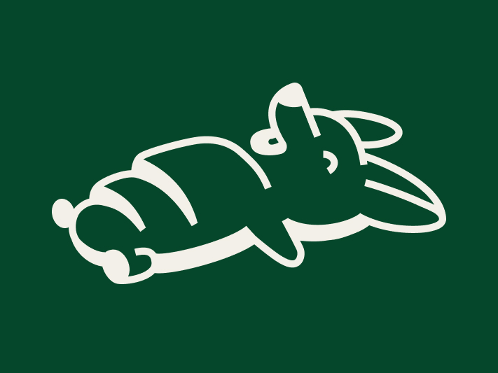
A hybrid mark that reads as both the corgi and the salt bread, drawn to match Rari-Tea's type and built to scale down to a stamp.
Shio's Pan is a limited-release salt bread sold only through Rari-Tea on select Saturdays, made by a separate owner. The owner set the brand architecture, an in-house extension that reads as part of the Rari-Tea family while standing on its own. My job was to make that relationship visible and design the mark that carries it.
The mark had to read as both Shio the corgi and salt bread, hold the family resemblance to Rari-Tea, and survive at stamp size in one color. Those constraints drove every decision that followed.
The work was logo-led. Each decision protected one thing: the mark stays readable as both ideas, at any size, in one color.
I built the identity around a single hybrid mark instead of a mascot beside a wordmark. The body segments do double duty as the bread's coils and the dog's form, so one shape carries the premise that Shio is the feeling of the product.
I set the wordmark in Rari-Tea's own typeface so the type itself signals the relationship, not just the curated-by line. Customers already read that typeface as Rari-Tea, so reusing it ties the two brands before anyone reads a word.
I drew the mark's strokes thick to match the weight of that typeface, so the brandmark and wordmark balance instead of competing. The goal was a lockup that looks designed together, not a mark and text placed side by side.
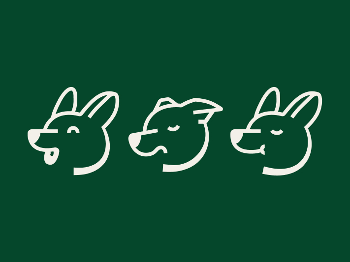
I drew a corgi-head submark set for small spaces where the full hybrid is too detailed, then gave it a function. The three expressions signal whether salt bread is for sale, sold out, or not selling that day. Everything runs in one color on the green and cream inherited from Rari-Tea.
The delivered system, four parts.
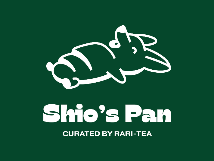
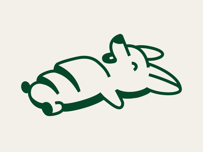
PRIMARY MARK
The hybrid brandmark.
· Dual read. Corgi and salt bread in one continuous outline.
· Matched weight. Thick strokes tuned to the wordmark so the two balance.
· One color. Reproduces as a solid in black, white, or brand green.
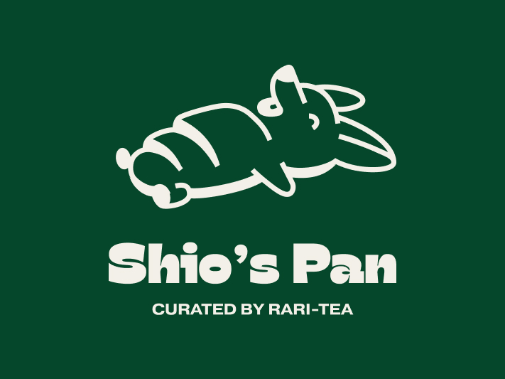
WORDMARK & LOCKUP
The wordmark and full lockup.
· Shared typeface. Rari-Tea's own face, used as the main signal of the tie.
· Relationship line. Curated by Rari-Tea makes the connection explicit without claiming Rari-Tea made it.
· Locked stack. Mark, wordmark, and tagline fixed for primary use.
SUBMARKS
The corgi-head submark set.
· Status signal. Three expressions for sale, sold out, and not selling that day.
· Built for small. Drops the bread read so the face survives at stamp scale.
· One-color ready. Reverses on brand green or sits solid on white.
APPLICATION
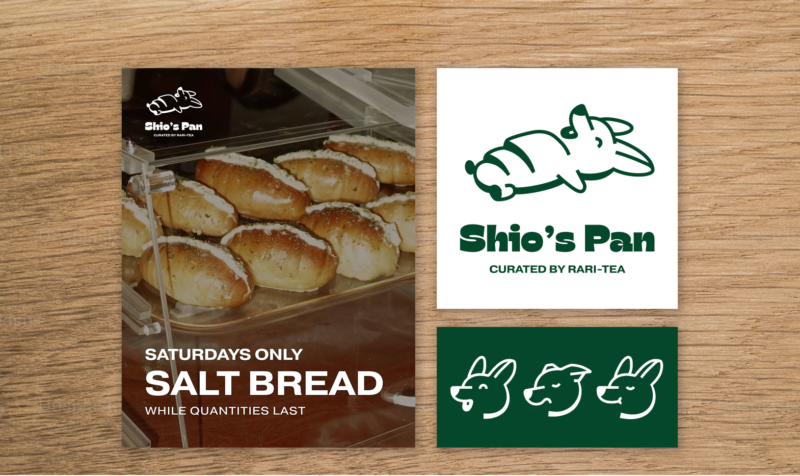
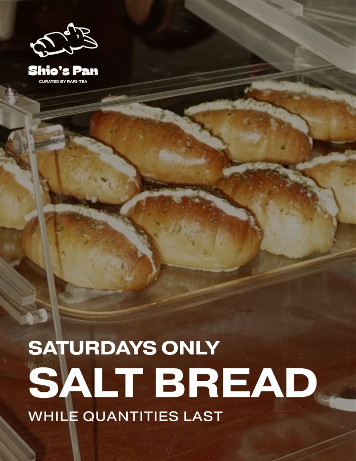
The Saturday-only flyer, designed by me.
· Designed by me. Flyer built on the owner's product photo.
· Reversed lockup. The white mark holds over the photo.
· Inherited color and message. Type and tagline frame the limited Saturday drop.
The provable win is the work itself: a sub-brand mark that reads as family, carries two ideas in one shape, and holds from full lockup down to a stamp-sized face. No business results are claimed. The job was a tight, defensible logo system, and that is what it delivers.
Craft win: the mark and the type share a weight and a language, so the lockup reads as one designed unit.
System win: the submarks do double duty, surviving small scale while signalling daily availability.
Constraint carried forward: inside a parent brand, distinction has to come from the mark while the shared type holds the family tie, a balance I would push further with more time.